Project
Infographics
Company
SyFy
Timeline
2022-2025
My role was
Graphic Designer
Overview
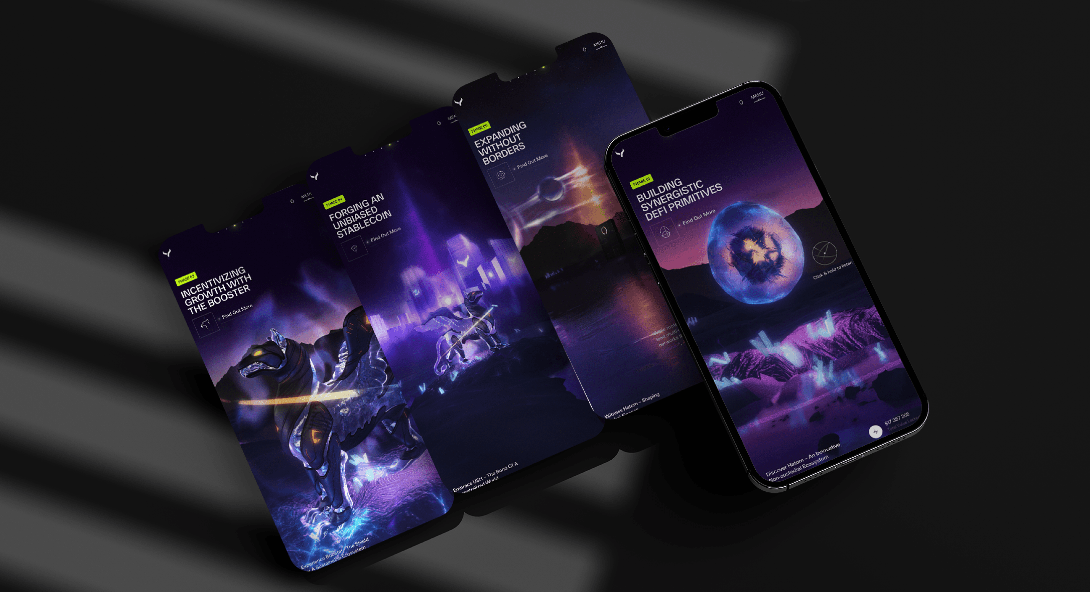
Designing a series of infographics to communicate complex cross-chain and protocol-level interactions within a DeFi ecosystem. The goal was to translate highly technical processes—such as asset flows, validation layers, and cross-chain communication—into clear, structured, and visually understandable diagrams.
The work emphasizes clarity, hierarchy, and visual consistency, using a system of nodes, connections, and color-coded flows to simplify abstract concepts. Each diagram is designed to help users quickly grasp relationships between components, making technical infrastructure more accessible to both technical and non-technical audiences.

Challanges
The primary challenge was simplifying highly technical and abstract systems without losing accuracy. Cross-chain interactions, validation layers, and protocol communication involve multiple steps and dependencies, making it difficult to present information in a way that is both precise and easy to understand.
Another key challenge was managing visual complexity. The diagrams needed to display multiple layers of information—such as flows, states, and relationships—while avoiding clutter and cognitive overload. This required careful use of spacing, color, and hierarchy to guide the viewer’s attention.
Additionally, maintaining consistency across different diagrams was essential. Each visualization needed to follow a unified visual language so users could quickly recognize patterns and understand new concepts without relearning the interface.


Results
The final infographics provide a clear and structured representation of complex protocol interactions, enabling users to better understand cross-chain processes and system architecture at a glance. By organizing information into consistent visual patterns and flows, the diagrams reduce cognitive load and improve comprehension of otherwise abstract concepts.
The use of a unified visual system ensures scalability across multiple diagrams, allowing new concepts to be introduced without increasing complexity. Overall, the project demonstrates an ability to translate technical systems into accessible visual narratives, supporting both education and product communication within a DeFi context.

Project
Infographics
Company
SyFy
Timeline
2022-2025
My role was
Graphic Designer
Overview
Designing a series of infographics to communicate complex cross-chain and protocol-level interactions within a DeFi ecosystem. The goal was to translate highly technical processes—such as asset flows, validation layers, and cross-chain communication—into clear, structured, and visually understandable diagrams.
The work emphasizes clarity, hierarchy, and visual consistency, using a system of nodes, connections, and color-coded flows to simplify abstract concepts. Each diagram is designed to help users quickly grasp relationships between components, making technical infrastructure more accessible to both technical and non-technical audiences.
Challanges
The primary challenge was simplifying highly technical and abstract systems without losing accuracy. Cross-chain interactions, validation layers, and protocol communication involve multiple steps and dependencies, making it difficult to present information in a way that is both precise and easy to understand.
Another key challenge was managing visual complexity. The diagrams needed to display multiple layers of information—such as flows, states, and relationships—while avoiding clutter and cognitive overload. This required careful use of spacing, color, and hierarchy to guide the viewer’s attention.
Additionally, maintaining consistency across different diagrams was essential. Each visualization needed to follow a unified visual language so users could quickly recognize patterns and understand new concepts without relearning the interface.
Results
The final infographics provide a clear and structured representation of complex protocol interactions, enabling users to better understand cross-chain processes and system architecture at a glance. By organizing information into consistent visual patterns and flows, the diagrams reduce cognitive load and improve comprehension of otherwise abstract concepts.
The use of a unified visual system ensures scalability across multiple diagrams, allowing new concepts to be introduced without increasing complexity. Overall, the project demonstrates an ability to translate technical systems into accessible visual narratives, supporting both education and product communication within a DeFi context.