Overview
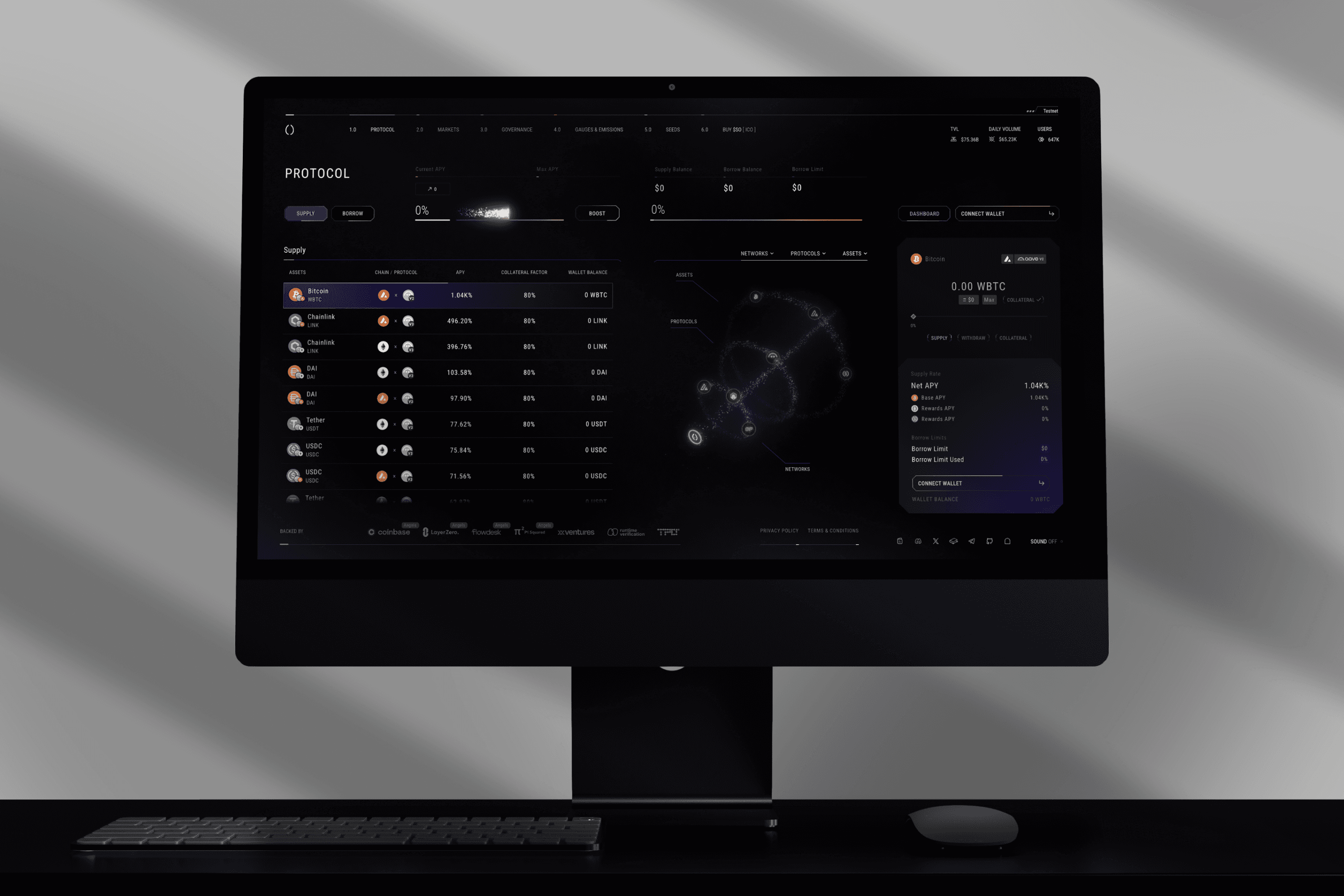
Full redesign of the Soul Labs landing experience and Docs pag, aligning the platform’s interface with its evolving mission, vision, and product direction. The goal was to transform a fragmented and unclear experience into a cohesive, narrative-driven entry point that communicates the value of a complex DeFi ecosystem.
The redesign introduced a unified visual system, clearer messaging, and a structured user journey that guides visitors seamlessly from discovery to product interaction. In parallel, a dedicated Public Sale page was created to support the fundraising process, simplifying complex information and enabling users to confidently participate in the launch.
Challanges
The original experience lacked a clear narrative and cohesive identity, making it difficult for users to understand the product and its value proposition. One of the main challenges was restructuring the content and information architecture to create a logical, guided journey that communicates a complex protocol in a simple and approachable way.
Another key challenge was balancing clarity with conversion. The landing page needed to educate users while also driving engagement with the testnet and supporting participation in the public sale. This required aligning messaging, visual hierarchy, and interaction design to reduce friction and build trust.
Additionally, designing for a fundraising context introduced higher expectations around credibility and transparency. The interface had to clearly explain processes, reduce uncertainty, and guide users through critical actions without overwhelming them.


Before
After
Before
After


After
Results
The redesigned experience delivers a clear and cohesive narrative that improves user understanding and guides visitors more effectively into the product ecosystem. The introduction of a unified visual system and structured content flow enhances both usability and brand perception.
The project contributed to significant growth, including over 647K unique visitors and a 45% increase in conversion to testnet, while also supporting a successful $10M fundraising round. The dedicated Public Sale experience improved clarity and user confidence during the launch process, reinforcing trust and reducing friction in high-stakes interactions.
Overall, the redesign demonstrates how strong information architecture, clear messaging, and thoughtful interaction design can drive both engagement and conversion in complex Web3 products.
Results
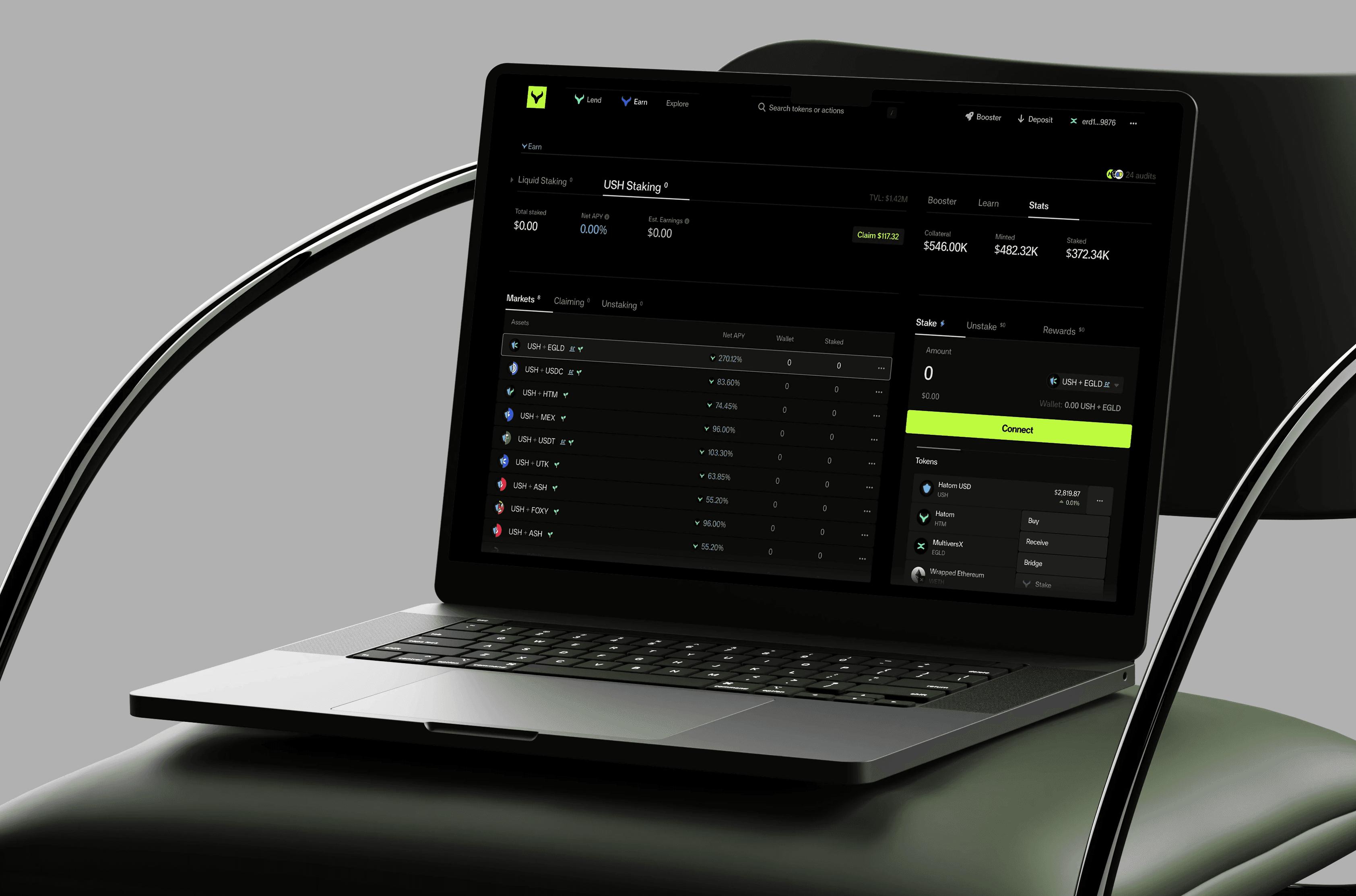
The redesigned landing page delivers a clear and engaging introduction to the Hatom ecosystem, guiding users through its products in a structured and intuitive way. The use of a phased storytelling approach improves comprehension and reduces cognitive load, allowing users to better understand the platform’s value.
The integration of interactive and 3D elements enhances engagement without compromising usability, creating a more memorable and modern brand experience. The project also contributed to a stronger visual identity and increased perceived trust, positioning Hatom as a leading and credible player within the DeFi space.
The outcome was recognized with multiple industry awards, including FWA PCA 2025 and Awwwards nominations, highlighting the project’s success in combining design innovation with functional clarity.

Awards
$10M Raised
647K + Unique Visitors
+45% Conversion to Testnet

Awards
$10M Raised
647K + Unique Visitors
+45% Conversion to Testnet
Overview
Full redesign of the Soul Labs landing experience and Docs pag, aligning the platform’s interface with its evolving mission, vision, and product direction. The goal was to transform a fragmented and unclear experience into a cohesive, narrative-driven entry point that communicates the value of a complex DeFi ecosystem.
The redesign introduced a unified visual system, clearer messaging, and a structured user journey that guides visitors seamlessly from discovery to product interaction. In parallel, a dedicated Public Sale page was created to support the fundraising process, simplifying complex information and enabling users to confidently participate in the launch.
Challanges
The original experience lacked a clear narrative and cohesive identity, making it difficult for users to understand the product and its value proposition. One of the main challenges was restructuring the content and information architecture to create a logical, guided journey that communicates a complex protocol in a simple and approachable way.
Another key challenge was balancing clarity with conversion. The landing page needed to educate users while also driving engagement with the testnet and supporting participation in the public sale. This required aligning messaging, visual hierarchy, and interaction design to reduce friction and build trust.
Additionally, designing for a fundraising context introduced higher expectations around credibility and transparency. The interface had to clearly explain processes, reduce uncertainty, and guide users through critical actions without overwhelming them.
Challanges
The original experience lacked a clear narrative and cohesive identity, making it difficult for users to understand the product and its value proposition. One of the main challenges was restructuring the content and information architecture to create a logical, guided journey that communicates a complex protocol in a simple and approachable way.
Another key challenge was balancing clarity with conversion. The landing page needed to educate users while also driving engagement with the testnet and supporting participation in the public sale. This required aligning messaging, visual hierarchy, and interaction design to reduce friction and build trust.
Additionally, designing for a fundraising context introduced higher expectations around credibility and transparency. The interface had to clearly explain processes, reduce uncertainty, and guide users through critical actions without overwhelming them.
Before
After
Before
After
After
Results
The redesigned experience delivers a clear and cohesive narrative that improves user understanding and guides visitors more effectively into the product ecosystem. The introduction of a unified visual system and structured content flow enhances both usability and brand perception.
The project contributed to significant growth, including over 647K unique visitors and a 45% increase in conversion to testnet, while also supporting a successful $10M fundraising round. The dedicated Public Sale experience improved clarity and user confidence during the launch process, reinforcing trust and reducing friction in high-stakes interactions.
Overall, the redesign demonstrates how strong information architecture, clear messaging, and thoughtful interaction design can drive both engagement and conversion in complex Web3 products.
Results
The redesigned landing page delivers a clear and engaging introduction to the Hatom ecosystem, guiding users through its products in a structured and intuitive way. The use of a phased storytelling approach improves comprehension and reduces cognitive load, allowing users to better understand the platform’s value.
The integration of interactive and 3D elements enhances engagement without compromising usability, creating a more memorable and modern brand experience. The project also contributed to a stronger visual identity and increased perceived trust, positioning Hatom as a leading and credible player within the DeFi space.
The outcome was recognized with multiple industry awards, including FWA PCA 2025 and Awwwards nominations, highlighting the project’s success in combining design innovation with functional clarity.
Awards
$10M Raised
647K + Unique Visitors
+45% Conversion to Testnet
Awards
$10M Raised
647K + Unique Visitors
+45% Conversion to Testnet